
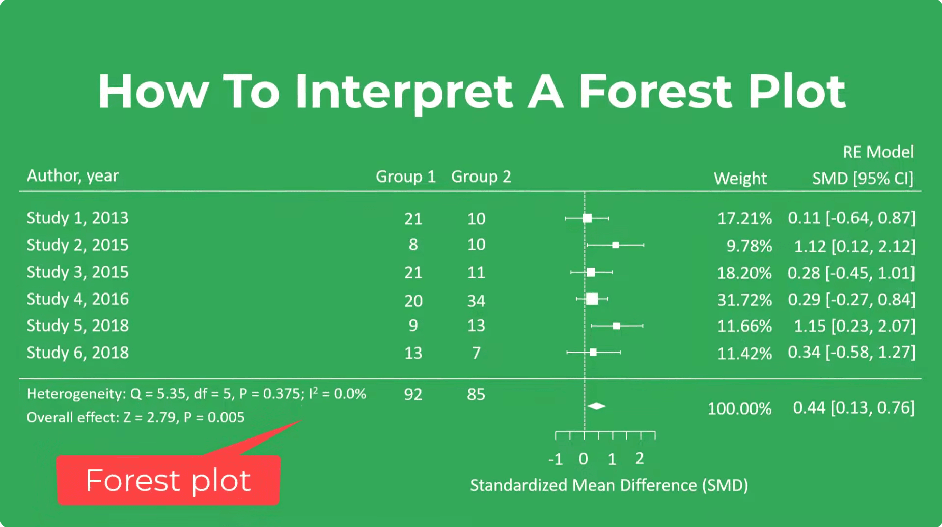
To read a forest plot, look at five things: (1) each square is one study's result, and its size shows the study's weight; (2) each horizontal line is that study's 95% confidence interval; (3) the vertical line of no effect sits at 1 for ratios (odds ratio, risk ratio, hazard ratio) or 0 for differences (mean difference, SMD); (4) the diamond at the bottom is the pooled result, and its width is the pooled confidence interval; if the diamond does not touch the line of no effect, the pooled result is statistically significant; (5) the heterogeneity statistics (I², τ², Q and its p value) show how consistent the studies are.
Have studies ready to pool? Our statisticians can run or check your meta-analysis. Get a free quote →
What is a forest plot?
A forest plot is the standard graph for showing the results of a meta-analysis. It displays the effect estimate and confidence interval from each included study, one per row, and the combined (pooled) estimate at the bottom. The name is usually explained as the plot looking like a forest of lines; Lewis and Clarke's (2001) often-cited BMJ article on its history is titled, fittingly, "Forest plots: trying to see the wood and the trees".
Forest plots appear in almost every systematic review with a meta-analysis, in Cochrane reviews, in clinical guidelines, and increasingly in single studies that report subgroup results. Being able to read one quickly is a core skill for evidence-based practice, for journal clubs, and for exams in medicine, nursing, pharmacy and public health.
The anatomy of a forest plot, element by element
| Element | What it shows | How to read it |
|---|---|---|
| Study labels (left column) | Author and year of each study | Often grouped by subgroup, sorted by year, weight or effect size |
| Numbers columns | Raw data: events and totals, or means, SDs and sample sizes per group | Lets you check the data and see which studies are large |
| Square (box) | The point estimate of each study | Bigger square = more weight in the meta-analysis |
| Horizontal line (whiskers) | The study's 95% confidence interval | Wider line = less precise estimate; arrows mean the interval runs off the scale |
| Vertical line of no effect | 1 for ratios, 0 for differences | An interval crossing this line is not statistically significant at the 5% level |
| Diamond | The pooled estimate (centre) and its confidence interval (width) | Narrow diamond = precise pooled estimate |
| Weight column | Each study's percentage contribution | Depends on precision and on the model (fixed or random effects) |
| Axis labels | Which side favours which group | Always check: "favours intervention" may be on the left or the right |
| Heterogeneity line | Q (Chi²), degrees of freedom, p value, I², and τ² for random effects | Describes how much the results vary between studies |
| Test for overall effect | Z statistic and p value for the pooled estimate | Whether the pooled effect differs from no effect |
The line of no effect: 1 or 0?
The most common mistake when reading a forest plot is looking for the line of no effect in the wrong place. It depends on the effect measure:
- Ratio measures (odds ratio, risk ratio, hazard ratio, rate ratio): no effect = 1. These are usually drawn on a logarithmic axis, so an odds ratio of 0.5 sits the same distance from 1 as an odds ratio of 2.
- Difference measures (mean difference, standardised mean difference, risk difference): no effect = 0, on a linear axis.
Whether a value to the left of the line is good or bad depends on the outcome. For a harmful outcome such as death or infection, a risk ratio below 1 favours the intervention. For a beneficial outcome such as recovery, a risk ratio above 1 favours the intervention. That is why the labels under the axis matter so much: read them before interpreting anything.
Squares, weights and why big studies look bigger
Each study's square is drawn in proportion to its weight. In the usual inverse-variance method, weight depends on the precision of the estimate: studies with more participants or more events have narrower confidence intervals, more weight and bigger squares. This design draws your eye to the studies that contribute most, and away from small studies with wide intervals, which would otherwise dominate visually because their long lines take up more space.
Weights change with the model. A fixed-effect model gives large studies a great deal of weight. A random-effects model adds an estimate of between-study variance (τ²) to every study's variance, which makes the weights more even; small studies gain weight and large studies lose some. If a forest plot shows noticeably different weights to what you expected, check which model was used.
Reading the diamond: the pooled result
The diamond summarises the meta-analysis. Its centre is the pooled effect estimate and its left and right points are the ends of the pooled 95% confidence interval.
- Where is the centre? This tells you the direction and size of the average effect.
- Does the diamond cross the line of no effect? If it does not, the pooled result is statistically significant at the 5% level. The "Test for overall effect" p value confirms this.
- How wide is it? A narrow diamond means a precise estimate. A wide diamond, even one that does not cross the line, may include effects too small to matter clinically.
- Is there a prediction interval? Some plots add a line or bar through or under the diamond showing the 95% prediction interval (Riley et al., 2011): the range in which the effect in a new similar setting is expected to lie. When heterogeneity is high, this is much wider than the diamond.
Statistical significance is not the same as clinical importance. Compare the diamond with the smallest effect that would matter to patients, sometimes called the minimal clinically important difference.
Heterogeneity: I², τ² and the Chi² test
Below the studies you will usually find a line such as: Heterogeneity: Tau² = 0.04; Chi² = 21.3, df = 9 (P = 0.01); I² = 58%. Each part has a job:
- Chi² (Cochran's Q) with its degrees of freedom (number of studies minus one) and p value tests whether the variation between studies is greater than chance. It has low power with few studies, so a non-significant result does not prove the studies are consistent.
- I² (Higgins et al., 2003) is the percentage of variation across studies due to heterogeneity rather than chance. The Cochrane Handbook's rough guide (Deeks et al., 2024): 0% to 40% might not be important; 30% to 60% may be moderate; 50% to 90% may be substantial; 75% to 100% considerable.
- Tau² (τ²) estimates the variance of true effects between studies, on the scale of the analysis (for ratios, the log scale).
You can also judge heterogeneity by eye. If the confidence intervals of the studies overlap a lot and the squares sit on both sides of a similar value, heterogeneity is likely low. If some studies show clear benefit and others clear harm, with little overlap, heterogeneity is high, and the diamond on its own is a poor summary.
Worked example: interpreting a forest plot step by step
Imagine a meta-analysis of eight randomised trials comparing a fall-prevention exercise programme with usual care in older adults. The outcome is the number of people who fell during follow-up, analysed as a risk ratio with a random-effects model. The results line reads:
Pooled risk ratio 0.78 (95% CI 0.68 to 0.90); Test for overall effect: Z = 3.45 (P = 0.0006).
Heterogeneity: Tau² = 0.02; Chi² = 12.6, df = 7 (P = 0.08); I² = 44%.
Axis: "Favours exercise" on the left, "Favours usual care" on the right.
- Measure and line of no effect: risk ratio, so no effect is 1. Falls are harmful, so values below 1 favour exercise, and the axis label confirms it.
- Pooled estimate: 0.78 means the risk of falling was, on average, 22% lower with exercise.
- Precision and significance: the 95% CI (0.68 to 0.90) does not include 1, so the result is statistically significant. The whole interval favours exercise, from a 32% to a 10% relative reduction.
- Heterogeneity: I² of 44% suggests moderate inconsistency; the Chi² test is not significant (P = 0.08), but with only eight studies it has low power. Look at the plot to see whether one or two studies differ, and check for subgroup analyses.
- Weights: if one large trial carries, say, 30% of the weight, check whether the conclusion holds without it (a leave-one-out sensitivity analysis).
- Absolute effect: a relative reduction means different things at different baseline risks. If 40% of people fall each year without the programme, a risk ratio of 0.78 corresponds to about 31% falling with it, or roughly 9 fewer fallers per 100 people.
Forest plots with subgroups
Many forest plots split the studies into subgroups, for example by dose, age group, setting or risk of bias, each with its own diamond, followed by an overall diamond. At the bottom you will find a test for subgroup differences (Chi², df, p value and I²).
This test, not the separate subgroup p values, is what tells you whether the effect differs between subgroups. A common error is to conclude that an intervention "works in women but not in men" because one subgroup diamond crosses the line and the other does not; the two subgroups may still be consistent with each other. Subgroup comparisons are also observational, even when the included studies are randomised trials, so treat them as hypothesis-generating unless they were pre-specified and supported by a plausible mechanism.
A 10-point checklist for reading any forest plot
- What is the question, population and outcome?
- Which effect measure is used, and is the line of no effect at 1 or 0?
- Which side favours which group?
- How many studies and participants are included?
- Which model (fixed or random effects) and method were used?
- Where is the diamond, and does it cross the line of no effect?
- Is the pooled effect large enough to matter clinically?
- How consistent are the studies (I², τ², visual overlap), and is there a prediction interval?
- Are any studies dominating the weights, or at high risk of bias?
- What is the certainty of the evidence (for example, the GRADE rating in a summary of findings table; Guyatt et al., 2008)?
Related plots you may see alongside a forest plot
- Funnel plot: each study's effect against its precision, used to look for small-study effects and possible publication bias. Build one with the funnel plot generator.
- Cumulative forest plot: adds studies one at a time, often in order of publication, to show how the evidence evolved.
- Leave-one-out plot: repeats the meta-analysis omitting each study in turn.
- L'Abbé plot: the event rate in the intervention group against the control group for each study; try the L'Abbé plot generator.
- Summary ROC curve: used instead of a single forest plot in diagnostic test accuracy reviews, alongside paired forest plots of sensitivity and specificity; see the SROC curve generator.
Need help producing or interpreting forest plots?
If you are writing up a meta-analysis and want publication-ready forest plots, or need a statistician to check that your pooled estimates, weights and heterogeneity statistics are right, our meta-analysis service produces plots in R, RevMan or Stata with a plain-language interpretation you can build on. For the full process, read how to do a meta-analysis.
Frequently asked questions
What does the diamond mean in a forest plot?
The diamond shows the pooled result of the meta-analysis. Its centre is the combined effect estimate and its width is the 95% confidence interval. If it does not touch the line of no effect, the pooled result is statistically significant.
What is the line of no effect in a forest plot?
It is the vertical line where the intervention and comparison have the same effect: 1 for ratio measures such as odds ratios and risk ratios, and 0 for difference measures such as mean differences.
Why are some squares bigger than others?
The size of each square reflects the study's weight in the meta-analysis, which mainly depends on its precision. Larger studies with narrower confidence intervals usually get bigger squares.
What does I² mean on a forest plot?
I² is the percentage of variation between study results that is due to heterogeneity rather than chance. As a rough Cochrane guide (Deeks et al., 2024), 0% to 40% might not be important and 75% to 100% is considerable heterogeneity.
How do I know if a study result is significant on a forest plot?
If the study's horizontal confidence interval line does not cross the line of no effect, its result is statistically significant at the 5% level.
What is a prediction interval on a forest plot?
A prediction interval shows the range within which the true effect in a new, similar study or setting is expected to lie. It accounts for heterogeneity and is usually wider than the confidence interval around the diamond.
Sources
- Lewis S, Clarke M. Forest plots: trying to see the wood and the trees. BMJ 2001;322:1479-1480
- Deeks JJ, Higgins JPT, Altman DG, McKenzie JE, Veroniki AA, editors. Chapter 10: Analysing data and undertaking meta-analyses. In: Higgins JPT, Thomas J, Chandler J, et al., editors. Cochrane Handbook for Systematic Reviews of Interventions version 6.5. Cochrane; 2024
- Higgins JPT, Thompson SG, Deeks JJ, Altman DG. Measuring inconsistency in meta-analyses. BMJ 2003;327:557-560
- Riley RD, Higgins JPT, Deeks JJ. Interpretation of random effects meta-analyses. BMJ 2011;342:d549
- Guyatt GH, Oxman AD, Vist GE, et al. GRADE: an emerging consensus on rating quality of evidence and strength of recommendations. BMJ 2008;336:924-926

Keith has 17 years of experience in experimental psychology and cognitive and behavioral research. He brings an experimental research perspective to projects that examine cognition, perception, and behavior. Areas of expertise Experimental and behavioral studies Quantitative research projects and data analysis…