 TimelyScholar
Services › Data Visualization
Publication-quality figures, dashboards and infographics that make your data clear, accurate and accessible.
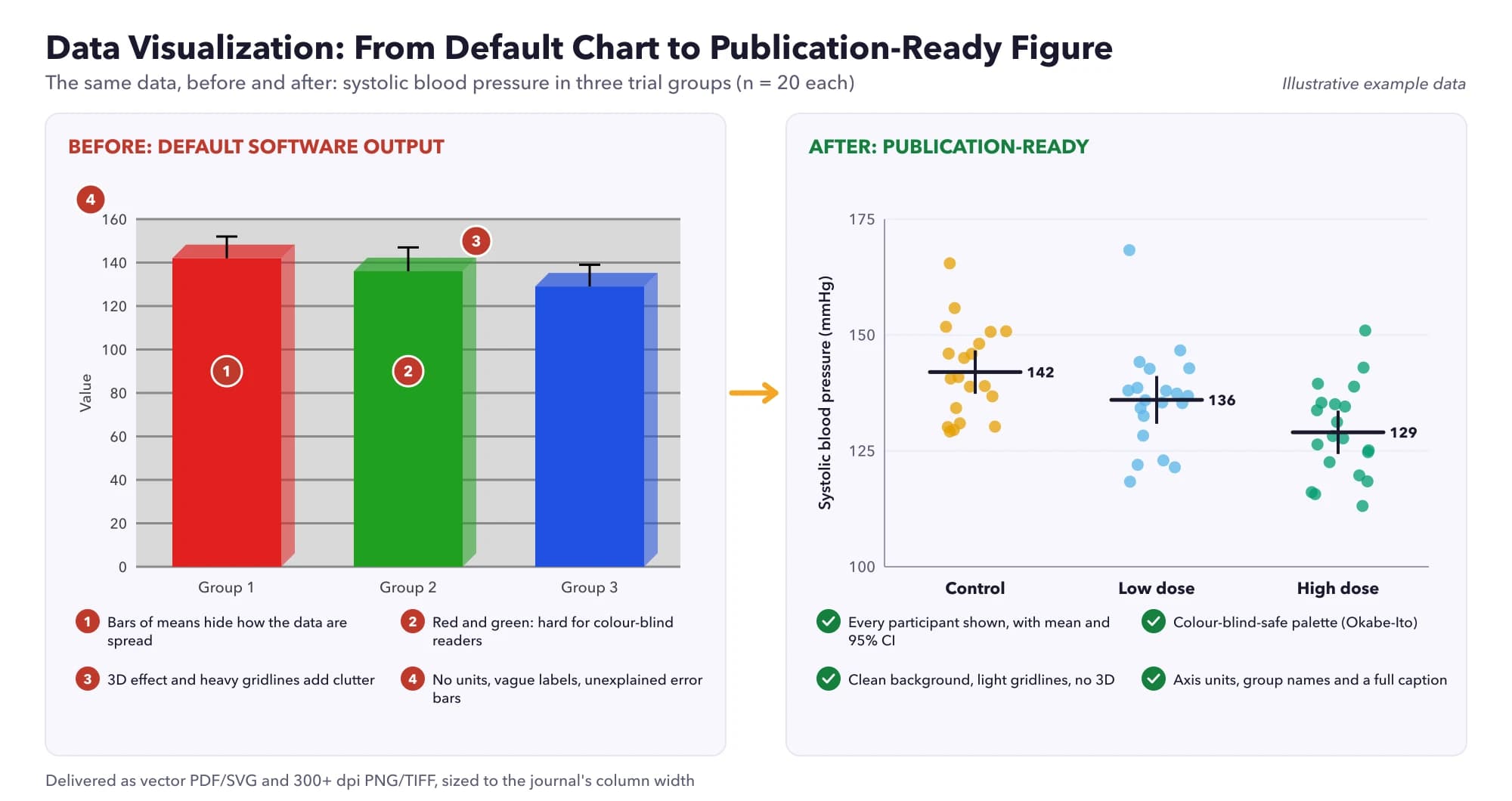
A good figure shows the message of your data at a glance without distorting it. We design publication-ready figures that follow published principles for better figures (Rougier et al., 2014) and your target journal's requirements.
We also build interactive dashboards in Power BI, Tableau and Excel, and create research infographics. Colours and text meet the WCAG 2.2 contrast guidelines so your visuals remain readable for everyone.
Bar charts, histograms, box plots, scatter and line charts chosen to fit your data.
Journal-ready figures for theses, articles, systematic reviews and meta-analyses, in R (ggplot2) or Python (matplotlib).
Visual summaries of research findings, survey results and clinical data.
Interactive dashboards in Power BI, Tableau and Excel.
Research, executive and performance reports with clear visuals.
Research, healthcare and educational infographics.
Clinical outcomes, epidemiological and public-health data.
Likert-scale charts, demographic breakdowns and cross-tabulations.
Maps of geographic distributions and outbreaks.
Visual narratives for presentations and stakeholders.
We agree what each figure or dashboard must show and for whom.
We pick chart types and tools suited to the data.
We build the visuals to journal or brand specifications.
We check accuracy, readability and colour contrast.
You receive high-resolution files and the source code or workbook.
Our methods follow published standards from recognised authorities, so your work holds up to supervisors, examiners and peer reviewers.
| Standard | What it covers | Source |
|---|---|---|
| Ten simple rules for better figures | Peer-reviewed principles for clear, honest scientific figures | Rougier NP, et al. Ten simple rules for better figures. PLoS Comput Biol 2014;10:e1003833 |
| WCAG 2.2 | Text contrast of at least 4.5:1 (3:1 for large text) for accessibility | W3C Web Content Accessibility Guidelines (WCAG) 2.2 |
| PRISMA 2020 | Flow diagrams for systematic reviews | Page MJ, et al. The PRISMA 2020 statement. BMJ 2021;372:n71 |
| Cochrane Handbook | Forest and funnel plots for meta-analyses | Cochrane Handbook, Chapter 10: Analysing data and undertaking meta-analyses |
Correct resolution and dimensions for the journal, legible fonts, honest scales, clear labels and accessible colours. We follow the journal's author guidelines.
Yes, with ggplot2 in R or matplotlib in Python, and we give you the code.
Yes, as well as Excel dashboards.
Yes. We check colour contrast against WCAG 2.2 and avoid relying on colour alone.
Yes. Your files are stored privately and only the people working on your project can open them. We sign a non-disclosure agreement on request.
Yes. After delivery you can request refinements within the agreed scope directly from your client dashboard.
Every project gets an itemised quote based on scope, complexity and deadline. You pay only after you accept the quote.
Request a free quote online, message us on WhatsApp or email us. A specialist will reply with an itemised quote within 2-4 business hours.
You remain the author. For publications, the ICMJE recommends acknowledging writing assistance and editing rather than listing it as authorship. For coursework, follow your institution's academic integrity policy.
Describe your project and a specialist will reply with an itemized quote within 2-4 business hours.
Prefer email? info@timelyscholar.com