
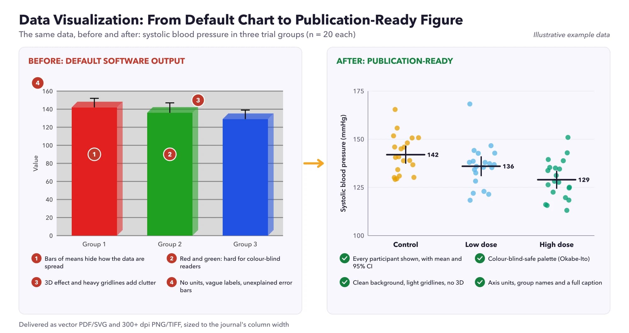
To make a good scientific figure: (1) decide the single message the figure must communicate; (2) choose the chart type that fits your data (show individual data points for small samples rather than bar charts of means); (3) label axes clearly with units; (4) use a colour-blind-safe palette and do not rely on colour alone; (5) remove clutter such as heavy gridlines, 3D effects and unnecessary borders; (6) use fonts large enough to read at final print size; (7) export in the format and resolution the journal requires (vector formats such as PDF, SVG or EPS for charts; high-resolution TIFF or PNG for images); and (8) write a caption that lets the figure stand alone.
Need clear, journal-ready figures? Our specialists can design them from your data. Get a free quote →
Why figures matter so much
Figures are often the first thing reviewers, editors and readers look at, and sometimes the only thing. A clear figure can make a complicated result obvious in seconds; a poor one can hide a real finding or, worse, suggest one that is not there. Figures are also reused in slides, posters, press releases and social media, so a well-designed figure keeps working long after publication.
Rougier et al.'s (2014) "Ten simple rules for better figures", published in PLOS Computational Biology, is one of the most widely shared guides on the topic. Its rules, along with the evidence and examples below, form the basis of this guide.
Rule 1: Know your message and your audience
Before opening any software, write one sentence describing what the figure should show: "Patients receiving the intervention recovered faster than controls", or "Gene expression clusters by tissue type, not by donor". Every design choice should serve that message.
Adapt the figure to the medium. A journal figure is read closely, at leisure, and can hold detail. A slide is seen for seconds from the back of a room, so it needs fewer elements and larger text. A poster sits between the two. Rougier et al. (2014) stress that the same figure rarely works equally well in all three.
Rule 2: Choose the right chart for your data
| What you want to show | Good choices | Avoid |
|---|---|---|
| Comparison of a continuous outcome between groups | Dot plot or strip plot with mean/median, box plot, violin plot | Bar chart of means only ("dynamite plot") |
| Relationship between two continuous variables | Scatter plot, with a fitted line if appropriate | Line chart connecting unordered points |
| Change over time | Line chart; individual trajectories for small samples | Bars for each time point |
| Distribution of one variable | Histogram, density plot, box plot | Pie chart |
| Parts of a whole | Stacked bar chart, or a simple table | 3D pie charts |
| Time to an event | Kaplan-Meier curve with numbers at risk | Bar chart of event rates at one time |
| Results of a meta-analysis | Forest plot, funnel plot | Tables alone |
| Many variables at once | Heatmap, PCA plot, small multiples | Overloaded single panel |
Show the data, not just the summary
Weissgerber et al. (2015) reviewed 703 research papers in leading physiology journals and found that most presented continuous data as bar or line graphs, while scatterplots, box plots and histograms were rare. That matters because very different data distributions, including ones with outliers, clusters or unequal group sizes, can produce identical bar graphs. For small samples, plotting every data point lets readers judge the results for themselves.
Rule 3: Label everything clearly
- Axis labels with units: "Systolic blood pressure (mmHg)", not "SBP".
- Readable tick labels: avoid excessive decimal places and crowded ticks.
- Direct labels next to lines or groups are easier to read than a separate legend.
- Sensible axis ranges: bar charts must start at zero because bar length encodes value; dot plots and line charts need not, but truncated axes should be obvious.
- Log scales for ratios (odds ratios, fold changes) and data spanning orders of magnitude, clearly labelled.
- Panel letters (A, B, C) for multi-panel figures, referred to in the caption and text.
Rule 4: Use colour carefully and accessibly
About 1 in 12 men have some form of colour vision deficiency, according to the US National Eye Institute (n.d.). The most common forms make red and green hard to distinguish, which is a problem for the red-green palettes still common in heatmaps and microscopy.
- Use a colour-blind-safe palette. Wong's (2011) Nature Methods column recommends a palette of distinguishable colours (now widely known as the Okabe-Ito palette) and suggests alternatives such as magenta and green instead of red and green for fluorescence images.
- Use perceptually uniform colour maps such as viridis for continuous data, rather than the rainbow (jet) map, which creates false boundaries.
- Use diverging palettes (for example blue-white-red) only when the data have a meaningful midpoint, such as zero change.
- Do not rely on colour alone: combine it with shape, line type, labels or position.
- Check in greyscale and with a colour-blindness simulator before submitting.
- Use colour to highlight, not decorate: grey for context, one strong colour for the key result.
Rule 5: Remove clutter and chartjunk
Default settings in spreadsheet and statistics software often add elements that distract from the data: heavy gridlines, grey backgrounds, borders, drop shadows and 3D effects. Remove anything that does not help the reader understand the message.
- Delete or lighten gridlines.
- Remove the box around the plot area if it adds nothing.
- Never use 3D for 2D data; it distorts lengths and areas.
- Avoid unnecessary legends when there is only one data series.
- Keep the aspect ratio sensible: very wide or tall plots exaggerate or hide slopes.
Rule 6: Design at final size with readable fonts
Most figures are shrunk to fit a journal column, and text that looked fine on your screen becomes unreadable. Check the journal's figure widths (commonly around one column, one-and-a-half columns or two columns) and design at that size from the start.
- Use a clean sans-serif font (for example Arial or Helvetica), consistent across all figures.
- Keep text at final size roughly between 6 and 12 points; check the journal's minimum.
- Keep line widths thick enough to survive reduction.
- Use the same fonts, colours and styles across all figures in a paper for a professional, consistent look.
Rule 7: Export the right file format and resolution
| Format | Type | Best for |
|---|---|---|
| PDF, EPS, SVG | Vector | Charts, graphs, diagrams; scale to any size without blurring |
| TIFF | Raster (lossless) | Photographs, microscopy, blots; widely accepted by journals |
| PNG | Raster (lossless) | Web, slides, and journals that accept it |
| JPEG | Raster (lossy) | Photographs for the web; avoid for charts, as compression blurs text and lines |
Resolution requirements vary by journal. Many ask for around 300 dpi at final size for photographs and higher resolutions for line art and combination figures, so always check the author guidelines before exporting. Vector formats avoid resolution problems entirely for charts.
For image data such as blots and micrographs, keep the original files. Adjust brightness and contrast only uniformly across the whole image and the controls, never selectively, and describe any processing in the methods. Journals increasingly screen images for inappropriate manipulation.
Building multi-panel figures
Journals often limit the number of figures, so related results are combined into panels. Done well, a multi-panel figure tells a story from left to right and top to bottom; done badly, it becomes a crowded collage.
- Arrange panels in the order they are discussed in the text.
- Align axes across panels, and use shared axes when panels show the same variable, so readers can compare directly.
- Keep the same colours for the same groups in every panel.
- Label panels with bold capital letters in the same corner of each panel.
- Assemble panels in a vector editor, or with layout tools in R (patchwork, cowplot) or Python, rather than pasting images into a word processor.
Table or figure?
Use a figure when the pattern matters more than the exact values: trends, distributions, comparisons and relationships. Use a table when readers need precise numbers, such as participant characteristics or regression coefficients. Do not present the same data in both. APA guidance, as summarised by the Purdue Online Writing Lab (n.d.), offers a useful rule of thumb: three or fewer numbers fit in a sentence, roughly 4 to 20 suit a table, and more than 20 may be clearer as a figure.
Rule 8: Write captions that let the figure stand alone
A reader should be able to understand a figure from the figure and its caption alone. A good caption includes:
- a short title stating the main finding or content;
- what is plotted (for example individual participants, means with 95% confidence intervals);
- the sample size for each group;
- definitions of abbreviations, symbols and error bars;
- the statistical test and what significance markers mean, if used.
Figure 2. Pain scores fell more with the intervention than with usual care. Points show individual participants; horizontal lines show group means with 95% confidence intervals (intervention n = 42, usual care n = 40). Pain measured on the NRS at 6 weeks. NRS = 0–10 numeric rating scale.
Always say what error bars represent. Standard deviation, standard error and confidence intervals look identical on a chart but mean very different things.
If you are writing in APA style, format figure numbers and titles according to APA 7; see our guide on how to report statistics in APA 7.
Software for scientific figures
| Tool | Strengths |
|---|---|
| R (ggplot2) | Free, reproducible, consistent grammar of graphics, huge range of extensions |
| Python (Matplotlib, seaborn) | Free, flexible, integrates with data analysis pipelines |
| GraphPad Prism | Point-and-click, popular in biomedical labs, good statistical integration |
| Inkscape / Adobe Illustrator | Final layout, multi-panel assembly and annotation of vector figures |
| BioRender and similar | Schematic diagrams and illustrations (check licence terms for publication) |
| Excel | Quick drafts; needs heavy customisation for publication quality |
Rougier et al. (2014) recommend using code-based tools where possible so figures can be regenerated when data change, and choosing the tool that gives you control over every element rather than accepting defaults.
Figure checklist before submission
- Does each figure have one clear message?
- Is the chart type appropriate, and are individual data shown for small samples?
- Are axes labelled with units, and are scales sensible?
- Is the palette colour-blind safe, and does the figure work in greyscale?
- Is text readable at final print size?
- Are error bars defined, and are sample sizes stated?
- Is the file in the required format and resolution?
- Does the caption let the figure stand alone?
- Are figures consistent in style throughout the paper?
Getting help with scientific figures
If you need publication-ready figures for a manuscript, thesis or poster, our data visualisation service creates clear, accurate, journal-compliant figures in R, Python or Prism, from forest plots and survival curves to heatmaps and multi-panel layouts, with the code so you can reproduce them.
Frequently asked questions
What makes a good scientific figure?
A good figure has one clear message, an appropriate chart type, clearly labelled axes with units, an accessible colour palette, no clutter, readable text at final size, and a caption that lets it stand alone.
Why should I avoid bar charts for continuous data?
Bar charts of means hide the distribution of the data. Very different datasets can produce identical bar charts, so for small samples it is better to show individual data points, box plots or violin plots.
What resolution do journal figures need?
It varies by journal. Many ask for around 300 dpi for photographs and higher for line art. Vector formats such as PDF, EPS or SVG avoid resolution problems for charts. Always check the author guidelines.
What colours are colour-blind friendly?
Palettes such as the Okabe-Ito palette recommended in Nature Methods, and perceptually uniform colour maps such as viridis. Avoid red-green combinations and do not rely on colour alone.
Should error bars show SD, SE or confidence intervals?
It depends on your purpose. SD describes variability in the data; SE and confidence intervals describe the precision of an estimate. Whatever you use, state it in the caption.
What is the best software for scientific figures?
R with ggplot2 and Python with Matplotlib are free, flexible and reproducible. GraphPad Prism is popular in biomedical labs. Vector editors such as Inkscape or Illustrator are useful for final layout.
Sources
- Rougier NP, Droettboom M, Bourne PE. Ten simple rules for better figures. PLoS Comput Biol 2014;10:e1003833
- Wong B. Points of view: Color blindness. Nat Methods 2011;8:441
- Purdue Online Writing Lab. APA numbers and statistics (7th edition). Purdue University; n.d.
- Weissgerber TL, Milic NM, Winham SJ, Garovic VD. Beyond bar and line graphs: time for a new data presentation paradigm. PLoS Biol 2015;13(4):e1002128
- National Eye Institute. Color blindness. n.d.